Presents

The Sky Bet Brand Playbook is your go-to guide for how we show up, speak out and stay consistent across every touchpoint. Whether you're crafting a campaign, designing a product, or briefing a partner, this is where you’ll find the plays that keep us united, on-brand, and ahead of the game.
Scroll to reveal
Scroll to reveal
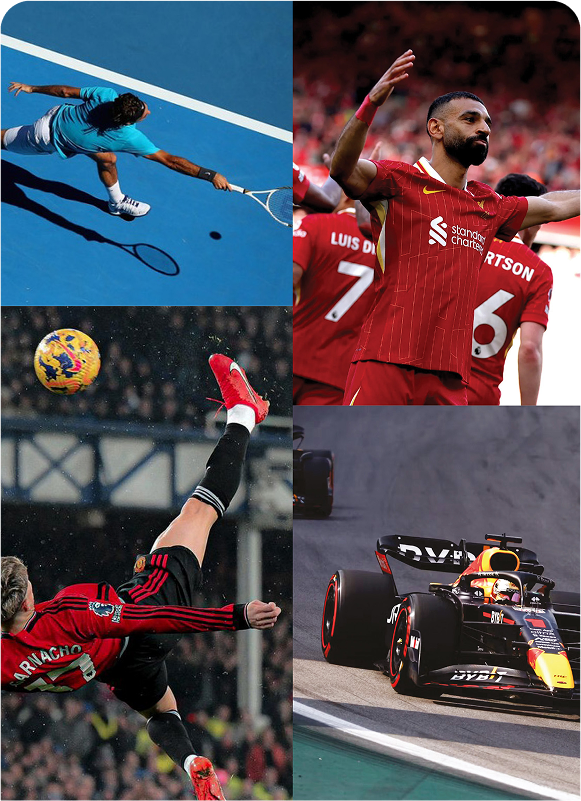
We got to the top by consistently standing out at the key events, innovating with new products, leading the way with free-to-play
and providing a generous suite of always on offers. On top of that, we’ve sponsored the EFL for over a decade and provided unrivalled content for fans.
If we want to stay at the top, we can’t rest on our laurels.
So much of the trust, awareness and credibility that we enjoy came from aligning ourselves to Sky Sports. This relationship has helped cement our position as the market leaders in sports betting for wellover a decade.
We’re known as part of the same family - if not the same brand altogether. So the way we express ourselves as a brand must always be to the standard expected from a Sky brand.
And this connection will
have a big role to play in
our exciting
future.
A great betting experience, whilst important, is table-stakes. We can’t stop there. Instead, everything we do needs to acknowledge that our customers are fans, and therefore we need to go beyond betting to enhance their experience.

Fandom
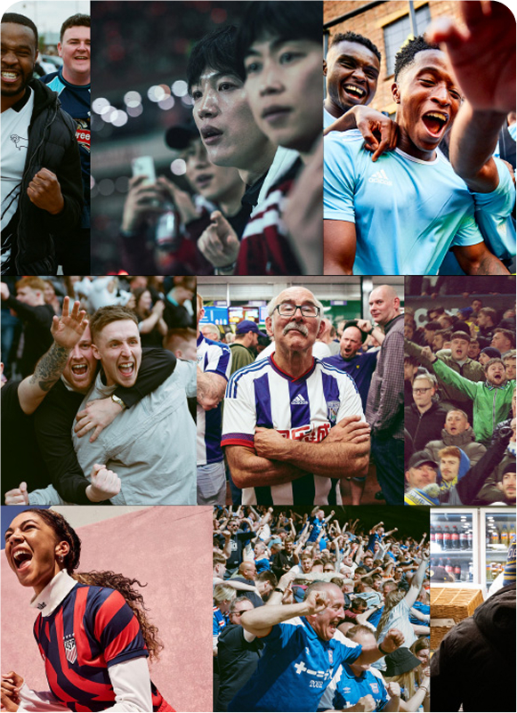
Fandom is no longer just about the 90 minutes. It’s a far-reaching cultural force, touching online communities, fashion collaborations, gaming streams, Instagram lifestyles, YouTube teams, politics and more.
Fans today exist across a spectrum, from the older die-hard match attendees who only care about their team, to the younger, more modern fans who engage much more widely with football culture.
There is one deeply emotional bond that they all have in common: they’re all hands down passionate sports fans. Their fandom is integral to everything we do.
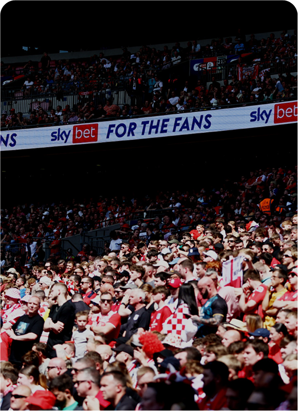
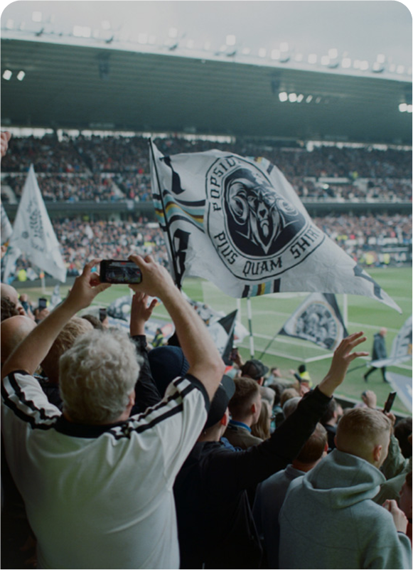
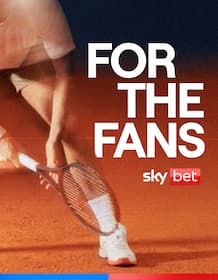
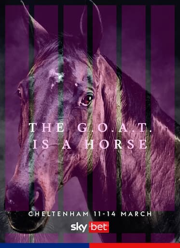
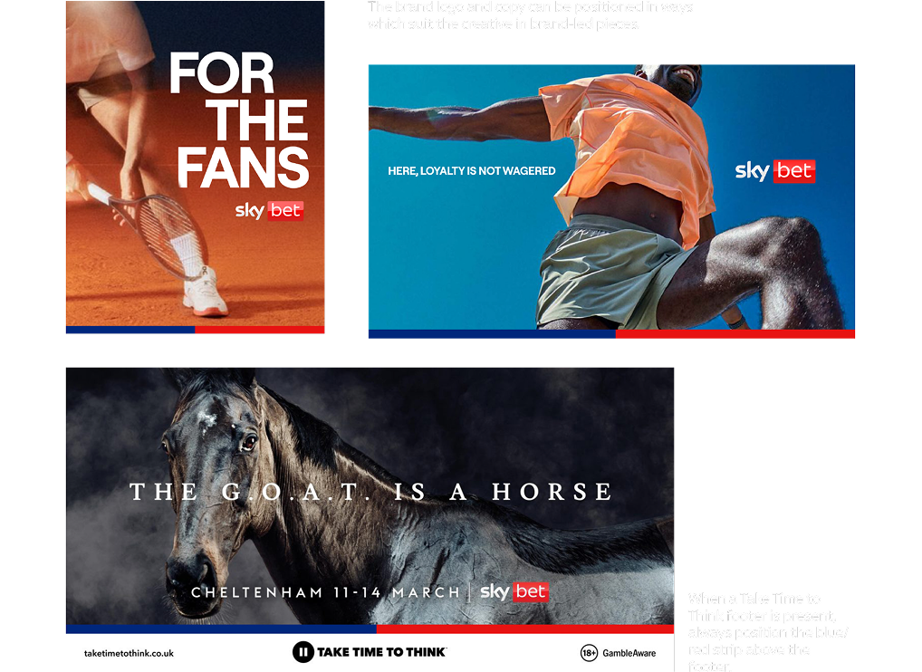
FOR THE FANS
We’re the only ones that can truly champion sports fans.
Beyond the credibility we inherited from Sky Sports, we’ve stood by fans and supported the EFL for over a decade. We’ve given fans a voice and a stage through our content. We’ve put our money where our mouth is and committed to funding fan community initiatives with the Building Foundations Fund and we’ve developed market-leading innovations that give fans control over the game with AccaFreeze.
We put fans at the heart of everything we do and committed to enhancing their experiences through betting and beyond.
A great betting experience, whilst important, is table-stakes. We can’t stop there. Instead, everything we do needs to acknowledge that our customers are fans, and therefore we need to go beyond betting to enhance their experience.

Our brand is designed to inject the energy,
drama and big entertainment of SKY into betting.
When placing our logo, always consider maximum legibility for brand standout. To help with this, we have created a clearspace rule as a guide. Use the height of the ‘S’ in the logo to identify the clearspace.
Lorem ipsum dolor sit amet, consectetur adipiscing elit. Donec a diam lectus. Sed sit amet ipsum mauris.
These are our primary-use logos, bold, iconic and confident. These are the basis of our brand identity and they inform our entire design system.
Lorem ipsum dolor sit amet, consectetur adipiscing elit, sed do eiusmod tempor incididunt ut labore et
Lorem ipsum dolor sit amet, consectetur adipiscing elit, sed do eiusmod tempor incididunt ut labore et dolore magna aliqua. Ut enim ad minim veniam, quis nostrud exercitation ullamco laboris nisi ut aliquip ex ea commodo consequat.
Lorem ipsum dolor sit amet, consectetur adipiscing elit, sed do eiusmod tempor incididunt ut labore et dolore magna aliqua. Ut enim ad minim veniam, quis nostrud exercitation ullamco laboris nisi ut aliquip ex ea commodo consequat.


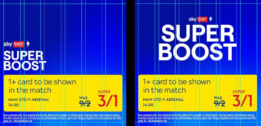
Vertically stacked format thrives in digital and portrait applications
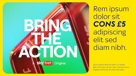
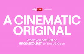
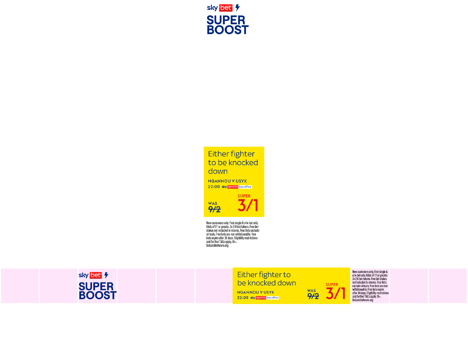
Over the years Sky Bet have a track record of moving first and changing the game, while others follow.We use the ‘Sky Bet Original’ precursor when communicating an offering which is exclusive to Sky Bet e.g. AccaFreeze. Even if the rest of the category follows suit, we can continue to feature, as the proud first movers – the Originals.


We never use “Sky Bet Presents” and “Sky Bet Original” together, it’s always one or other. Brand campaigns have the option to use “Sky Bet Presents”. Products that are exclusive to Sky Bet can use “Sky Bet Original”


 Logo
Do's
Logo
Do's
Our logo embodies confidence and premium nature. Featuring the Sky Bet logo in our communications reinforces the trust our fans place in us. As our most valuable asset, it deserves the utmost care and respect. Here are some ways we can ensure that confidence and premium quality is consistent.
The logo can be used to qualify the message, before or after it.
The logo can be used to qualify the message, before or after it.
The logo can be used to qualify the message, before or after it.
The logo can be used to qualify the message, before or after it.
 Logo
Dont's
Logo
Dont's
Our logo embodies confidence and premium nature. Featuring the Sky Bet logo in our communications reinforces the trust our fans place in us. As our most valuable asset, it deserves the utmost care and respect. Here are some ways we can ensure that confidence and premium quality is consistent.
The logo can be used to qualify the message, before or after it.
The logo must always be in a prominent position and clearly legible.
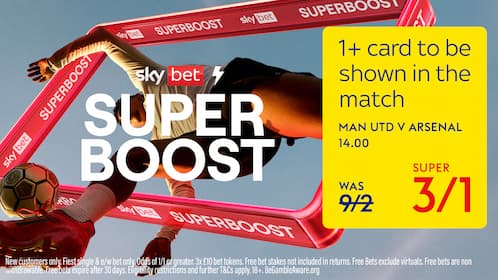
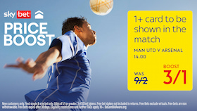
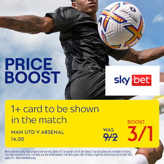
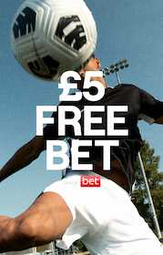
Do pair the logo with the offer text.
Place the logo where it makes sense according to your message.
Maintaining brand equity with a strong foundation of core colors.
Maintaining brand equity with a strong foundation of core colors.
 copy text
copy text
copy text
copy text
copy text
copy text
copy text
copy text
copy text
copy text
copy text
copy text
copy text
copy text
copy text
copy text
copy text
copy text
copy text
copy text
copy text
copy text
copy text
copy text
copy text
copy text
copy text
copy text
copy text
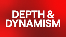
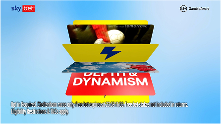
Inspired by the logo colours – introducing brand gradients with depth and dynamism.
By leveraging strategic color pairing, we maintain consistency while allowing for flexibility. Always look to use our colours together. This enables us to maintain consistency and recognisable brand presence across all touchpoints. As shown here, we can contrast a primary blue gradient background with red and white core accent colours e.g. white typography. Application can be flexible
By leveraging strategic color pairing, we maintain consistency while allowing for flexibility. Always look to use our colours together. This enables us to maintain consistency and recognisable brand presence across all touchpoints. As shown here, we can contrast a primary blue gradient background with red and white core accent colours e.g. white typography. Application can be flexible
 Colour
Dont's
Colour
Dont's
The use of colour is integral to making Sky Bet as distinctive and recognisable as possible.
Our palette shouldn’t be misinterpreted, modified or added to, always being used with great craft, care and consideration.
Do not create your own gradients.
Do not create your own gradients.
Do not create your own gradients.
Do not create your own gradients.
Our typography is a premium, versatile asset, injecting cinematic drama and distinctiveness into the brand. By introducing a new sans serif for headline messaging, we elevate Sky Bet with a confident, ownable look — one that is unmistakably and uniquely Sky Bet.
Roobert is our Primary Headline font. It can be used for short, attention grabbing statements or to highlight an offer - generally over an image or against our gradient backgrounds. We would not use Roobert with the Action Box.
Ensure the type feels integral to the layout. Refer to examples throughout this document for inspiration.
Used for larger areas of body copy
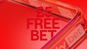
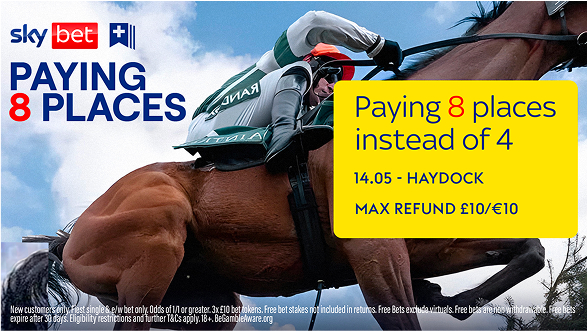
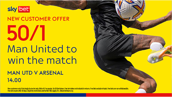
New customers only. First single & e/w bet only. Odds of 1/1 or greater. 3x £10 bet tokens. Free bet stakes not included in returns.
Always follow the typography guidance outlined in this document. For up-to-date templates, please reach out to Flutter Creative.
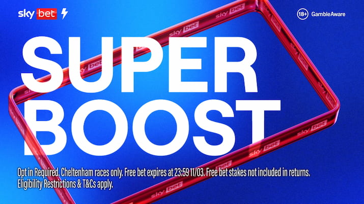
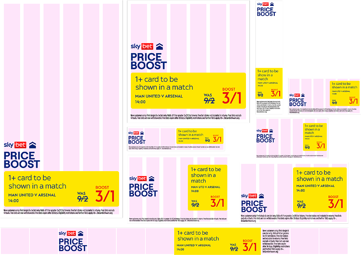
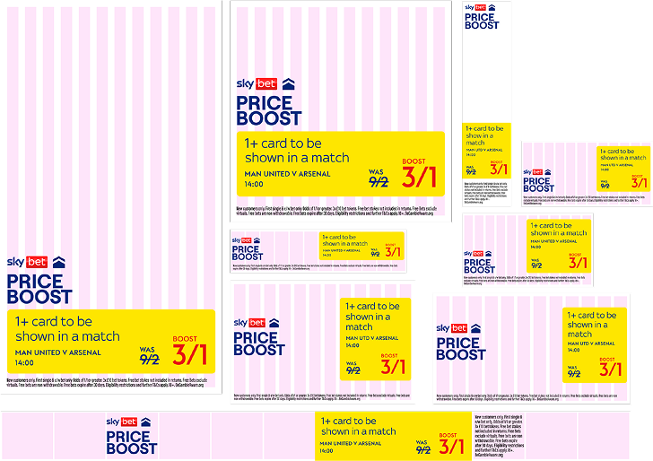
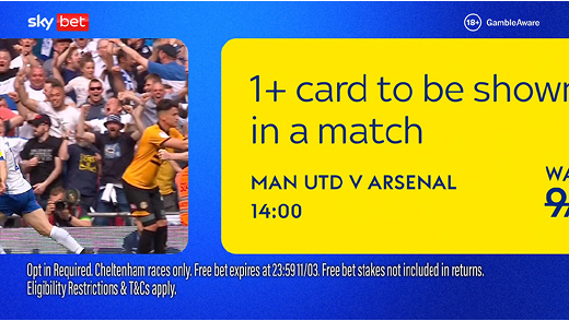
This is our Yellow Action Box – always yellow, always functional – always for our offers. All actionable content lives in here. For a detailed breakdown of how we set type for static applications, see page over. This will help maintain consistency and enhance legibility across all formats.
 Typography
Do's
Typography
Do's
Effective typesetting demands a keen eye. Our typographic approach builds a flexible system around our brand typefaces. It ensures consistency and structure while allowing for bold, unconventional, and experimental typography.
To to create a truly expressive Sky Bet composition, consider all our assets are working together.
The logo can be used to qualify the message, before or after it.
The logo can be used to qualify the message, before or after it.
The logo can be used to qualify the message, before or after it.
The logo can be used to qualify the message, before or after it.
Typography
Dont's
Inconsistent or improper use of typography can weaken brand identity and readability. Avoid misusing fonts, distorting type, or disregarding spacing principles, ensuring every execution remains premium and unmistakably Sky Bet.
The logo can be used to qualify the message, before or after it.
The logo can be used to qualify the message, before or after it.
The logo can be used to qualify the message, before or after it.
The logo can be used to qualify the message, before or after it.
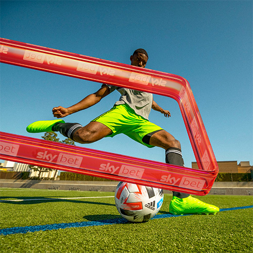
The ‘Bet’ box has been reimagined as a portal to the heart of what matters to fans. We call it ‘THE VIEWFINDER’ a window to the energy and drama of sport.
A short animated intro and outro sequence that distills the action of sports into the logo.
An animated sequence that conveys a range of moments and sports, all contained within Sky Bet.
A 3D graphic representation of the Viewfinder, used to customise imagery and introduce a visible brand presence.
For short, time-restricted sequences we can open with our Viewfinder animation as our branded bumper for BAU comms and campaign films, if it works with the creative content. The outro animation replaces our ‘curtains’ and should be used as the sign-off for all motion creative. Reach out to Flutter Creative or the Sky Bet Brand team for AV examples.
A bespoke carousel animation sequence exists for communicating the breadth of sports and elevated moments with Sky Bet. Reach out to Flutter Creative or the Sky Bet Brand team for AV examples.
The ‘Bet’ box has been reimagined as a portal to the heart of what matters to fans. We call it ‘THE VIEWFINDER’ a window to the energy and drama of sport.
Combined with imagery to highlight moments of action
Combined with imagery to highlight moments of action
 Viewfinder
Do's
Viewfinder
Do's
Our logo embodies confidence and premium nature. Featuring the Sky Bet logo in our communications reinforces the trust our fans place in us. As our most valuable asset, it deserves the utmost care and respect. Here are some ways we can ensure that confidence and premium quality is consistent.
The logo can be used to qualify the message, before or after it.
The logo can be used to qualify the message, before or after it.
The logo can be used to qualify the message, before or after it.
The logo can be used to qualify the message, before or after it.
Viewfinder
Dont's
Our logo embodies confidence and premium nature. Featuring the Sky Bet logo in our communications reinforces the trust our fans place in us. As our most valuable asset, it deserves the utmost care and respect. Here are some ways we can ensure that confidence and premium quality is consistent.
The logo can be used to qualify the message, before or after it.
The logo can be used to qualify the message, before or after it.
The logo can be used to qualify the message, before or after it.
The logo can be used to qualify the message, before or after it.
Iconic compositions, with dramatic aesthetics and craft to elevate the ordinary into something epic.
Iconic compositions, with dramatic aesthetics and craft to elevate the ordinary into something epic.
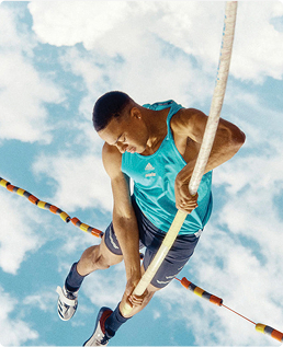
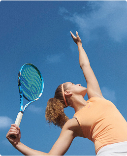
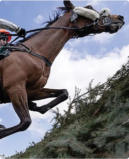
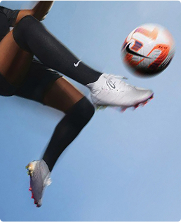
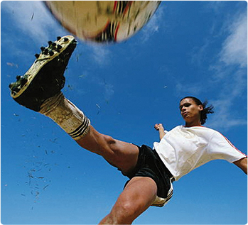
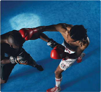
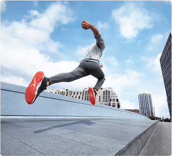
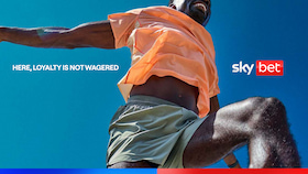
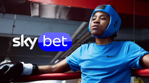
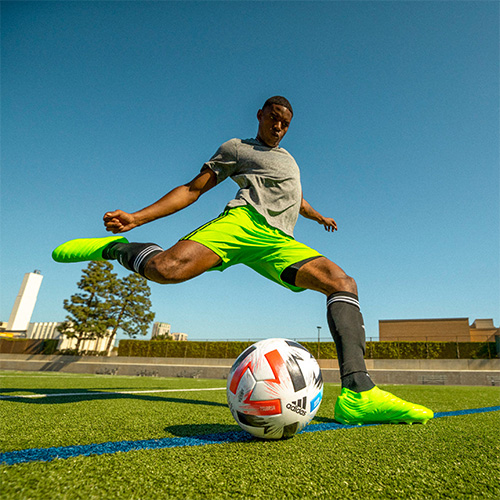
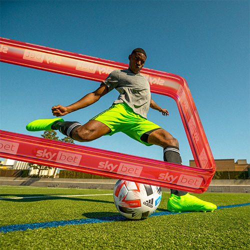
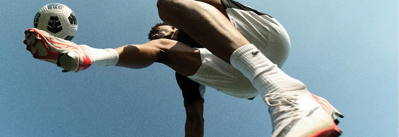
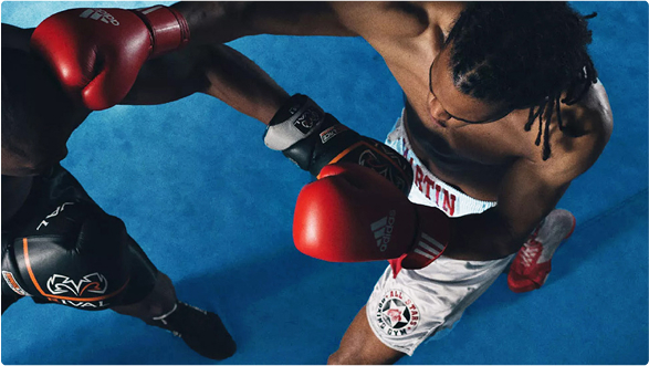
We shoot against a predominantly blue backdrop, with styling and environmental props to inject our brand world colours into the scenes. Use real world sporting action with bold, dynamic angles that create distinctivity.
 Imagery
Dont's
Imagery
Dont's
Our use of imagery underpins the aesthetic we want to convey for our always-on communications. Images must not be cluttered or lack a clear dynamic focal point. The focal point should be the action not the athletes face. Avoid Photoshop effects or over stylised imagery as they cheapen our aesthetic and add unnecessary clutter. Ensure every image is considered and recognisably Sky Bet.
The logo can be used to qualify the message, before or after it.
The logo can be used to qualify the message, before or after it.
The logo can be used to qualify the message, before or after it.
The logo can be used to qualify the message, before or after it.
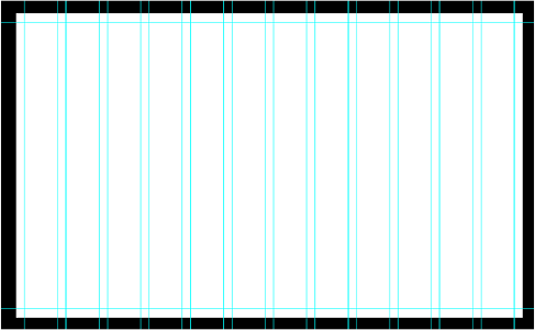
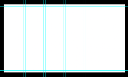
Inspired by the shape of the Viewfinder, we have a grid system that allows us to present a unified and consistent brand across any touchpoint, from campaign to BAU.
To keep all layouts unified, they must follow this rule. To establish the minimum margin and padding sizes find 3% of the shortest side of the canvas, rounded up/down to the nearest whole number. A 6-column layout for smaller digital placements or a 12-column layout for larger formats can be made using these defined margins and padding/gutters. Shortest side (y) / 100 x 3 = Margins and padding
6x6 Grid - For banner media & smaller placements
12x12 Grid - For larger formats, press & OOH
To keep all layouts unified, they must follow this rule. To establish the minimum margin and padding sizes find 3% of the shortest side of the canvas, rounded up/down to the nearest whole number. A 6-column layout for smaller digital placements or a 12-column layout for larger formats can be made using these defined margins and padding/gutters. Shortest side (y) / 100 x 3 = Margins and padding
The Action Box must use the same radius as per the BET portion of the Sky Bet logo. This must always be accurate. Only re-size this in vector format using Paths. If you do not constrain proportions (maintain the aspect ratio) this will change the radius of the logo.
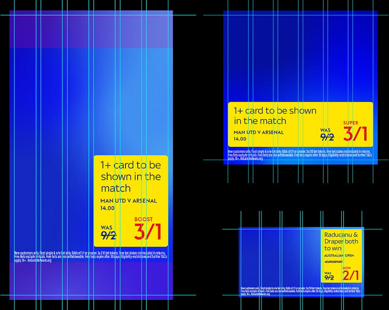
1920x1080px, 3% margin gutter= 32px
In very small spaces, gutters can be disregarded - instead, align to the top margin to increase the size of the Action Box.
In certain ‘extreme’ placements the grid system and margins will not apply i.e. skyscraper banners and extended mobile footers, where the amount of available space is reduced significantly. In these situations, we can remove the Action Box radius and fit it flush to the edge of the banner with no margin.
When positioning offer text, we can use one of two layouts - left-aligned or centred. Always lock up the logo to the top of the offer, factoring in the advised logo clearspace and sizing. For left-aligned offers, position the offer anywhere on the left (Y) axis. The size of this lockup will depend on the amount of available space and the image composition.
1. Left aligned
2. Centralised
Our typical canvas for all off-site, offer-led advertising. For smaller placements with limited space, we can remove the blue/red gradient strip from the base of the canvas.
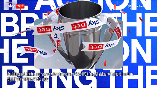
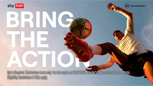
At brand comms level, where there are no offers, we rely on a more refined approach with no Action Box or yellow canvas: Logo, imagery and big messaging are all underpinned by the same grid system. To connect our brand world comms to our offer world we use our blue and red gradient colours to form our connective tissue.
In the absence of an Action Box, the logo can be positioned anywhere on the canvas that works with the creative layout.
Our typical canvas for all off-site, offer-led advertising. For smaller placements with limited space, we can remove the blue/red gradient strip from the base of the canvas.
Brand animation is born from the Viewfinder and is guided by two key principles:
Guided by our overarching principles, cinematic drama and iconic action - dynamic and refined motion treatments add depth through transitions and carousel like movements. Reach out to Flutter Creative or the Sky Bet Brand team for AV examples.
Transition from one scene to the next; frames move from right to left.
Vertically scrolling headline messaging paired with a central image.
Headlines can be paired with subtle motion photography.
The Viewfinder can be used as a device to transition from one scene to another.
This is our Icon suite. They have a lot of equity and understanding, so they have not changed. They should be used alongside the appropriate offer headline or product.
When offer text is present, we should display the corresponding offer logo alongside it. This should be positioned next to our logo, using the clearspace guidance as outlined on page 27. The height of the icon should be equal to the height of the ‘Bet Box’.

No files yet.